


Overview
CHALLENGE
Grad students in time-limited programs struggle to make social and professional connections
SOLUTION
A social meets professional app that allows grad students to connect for "coffee chats" with peers in similar research and mentors
METHODS
Contextual interviews, usability testing, heuristic evaluation
DELIVERABLES
thematic analysis, persona development, storyboards, paper prototype, figma prototype
ROLE
UX Researcher/Designer
TIME
One semester
TYPE
Group Project
TASK
Help short-term grad students build their professional network
TOOLS
Figma, Paper, IPad, Canva, Sketches
RESEARCH AND EMPATHIZE
Research
Before I began the design process, I wanted to investigate how serious this issue is among grad students and what current solutions exist toward helping those students build their social and professional networks.
Literature Review
-
Since grad students operate in an 'in-between' stage of life, they often feel intense social isolation on campus and struggle to meet new friends outside their program (Grady, Rebecca K., et al., 2014)
-
International grad students as well as students who attend grad school at a university other than their undergraduate school experience greater levels of social and professional isolation than their fellow grad students (Erichsen, Elizabeth A., and Doris U. Bolliger., 2011)
-
Graduate students are often perceived as completing a job rather than being students such as undergraduates (Camille Daniels, 2020)
-
Due to the intense workload of grad school, many students feel too overwhelmed to attend social events to meet new people (Skyler Cohen, 2016)
Competitive Analysis
After concluding my literature review, I wanted to examine the competitive landscape around building professional and social connections to uncover the gaps that still need to be fulfilled.

Contextual User Interviews
Since our user group consisted of short-term graduate students, we conducted 10 user interviews in locations where our participants felt were the best for socializing with peers. Our focus on these interviews was discovering the following:
-
How do our participants feel their social activity has varied from undergraduate to graduate school life?
-
In what ways do they work on building their professional network on campus?
-
How do our participants attempt to meet new friends?
-
What campus events / extracurriculars do our users participate in?
After the conclusion of our interviews, we were able to analyze our notes and construct an affinity diagram and four main insights of our user group.
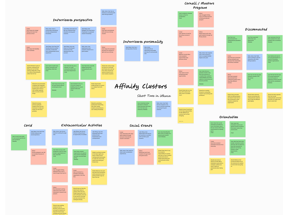
1
Time-constricted (1 year or shorter) programs limit the desire of many graduate students to build friendships
3
Graduate students are less likely to join student organizations as they feel their time is better spent on research and career development.
2
There is a higher demand to build professional connections rather than personal ones since students are likely in the midst of job recruitment
4
Graduate students feel a major disconnect between themselves and the undergraduate population
Persona Development
With direct insights about our user group and basic research completed, I now worked on created a persona to represent our average user. This persona allowed my team to empathize with our user group and better understand who we were designing for.
Nicky

Male. 23. Grad Student. Single
BACKGROUND
Nicky is pursuing a one-year masters program at Cornell in Mechanical engineering. He attended a different undergraduate university and lacks a strong network at Cornell.
LIFE GOALS
One day, Nicky hopes to attain a successful career at a job he enjoys and sustain the meaningful connections he cultivated during his graduate school years
END GOALS
Nicky wishes to connect with individuals within the Cornell community, spanning various departments, to broaden his social and professional network through forging new friendships.
EXPERIENCE GOALS
Nicky hopes to socialize with a varied group of peers who have similar career interests and to relieve the stress associated with job-recruitment.
DEFINE & IDEATE
Project Goals
Using 'User Goals,' 'Project Goals,' and 'Technical Considerations,' I created a venn diagram to help define the problem landscape and the main targets we'd need to focus on with our design.

Design Brainstorming
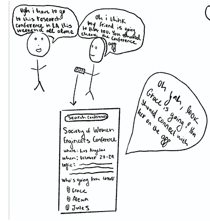
With clear design goals in mind and an in-depth understanding of our user group, my team and I brainstormed 60 possible design solutions. Below are some quick sketches of potential solutions that I created.

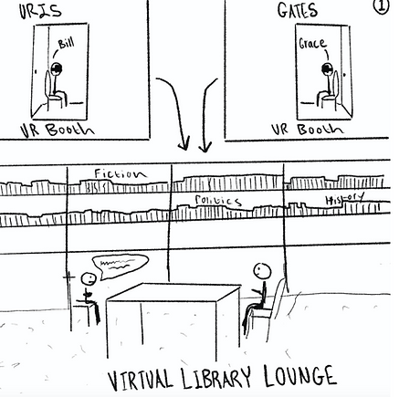
VR Booths placed around campus that place students in virtual social lounge
Conference connecting app so students can ride-share/co-plan their trips
Conference connecting app so students can ride-share/co-plan their trips
DESIGN AND ITERATE
Proposing a Design
After our brainstorming session, we ultimately decided to work with my proposed app "Coffee Chat." This application would operate under a mix between facilitating social connects such as apps like "Bumble Friends" whilst still maintaining a professional aesthetic similar to LinkedIn.
Main App Features
After talking through the "Coffee Chat" idea, we isolated four features that the app must possess:
-
Users can match and invite graduate peers to coffee chats on campus
-
Users can match with and invite mentors to coffee chats on campus
-
Users can confirm the attendance of their coffee chat partners to maintain accountability
-
Users can earn rewards by attending chats to incentivize app usage
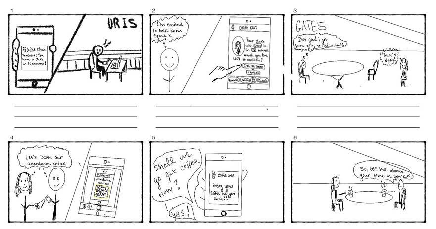
Storyboard
I then made a storyboard for every main feature of the app. These storyboards helped give us perspective into the user's optimal experience while using "Coffee Chat"
Paper Prototype
To begin testing how to organize information throughout the app, I did card sorting. Once I decided on a formate of organization, I wanted to test how the user flow would work. I built the following paper prototype to test the usability of the app's organization.

Usability Testing
Using my paper prototype, I conducted three usability tests with participants from our user group of Cornell graduate students. Their reactions and use of my paper prototype demonstrated the following necessary changes to the information organization of the app:
1
There should be a tab that users can navigate to in order to view their mentor options as opposed to pressing the plus sign on the connections page
2
The icon used to denote the 'Matches' page should be something more intuitive like a puzzle piece as opposed to a compass
3
Since users can lie about whether or not they will be present at the chat, the attendance question that appears should be given about the other person's attendance rather than a user's own attendance
LOFI Figma Wireframes
Based on the amendments from my usability test, I created lo-fidelity figma wireframes of our "Coffee Chat" app
Switch Match Tabs to connect with Students vs. Mentors
View connections on the 'Friends' page
Click on friend's profiles to generate chat invitations that sync user and friend's calendars

Claim rewards on the 'Awards' page
Generate the QR code that brings up the survey by pressing the corresponding scheduled meeting
Accepted meetings appear on the 'Chats' page


Heuristic Evaluation
After building the low-fidelity wireframes, I conducted a basic heuristic evaluation of the prototype to clarify what amendments I needed to make for the next iteration
Increase visibility for generating invitations and the attendance survey
Add 'Back,' 'Cancel,' and 'Reschedule' buttons for error recognition and recovery
Track claimed rewards to reduce user memory load
Create an option for the user to see past matches profiles so the user remains in control
Low-Fidelity Wireframes Iteration 2
With the insights from my heuristic evaluation in mind, I created second iteration of my lofi wireframes on Figma
1
Added an "Attendance" button on the home page to bring up survey
2
Gave users agency by allowing them to cancel/reschedule chats on the home page

3
Changed title of tabs to "Students" and "Mentors"


4
5
6
Added tracking on the awards page so users could see claimed rewards
Included "Invite" buttons and "profile" buttons
Added Chat feature so matches could communicate
Project Limitations
Time prevented my team from creating higher fidelity wireframes on Figma so I decided to continue the project on my own after our semester finished.
Usability Testing
Using our second iteration of wireframes, I conducted usability tests with 5 participants. Based on those tests, I found the following insights.
1
Overall aesthetic should be modernized, it looks too outdated
2
'Attendance,' 'Reschedule,' and 'Cancel' buttons on the 'Chat' page are too crowded
3
Location of chat feature is not intuitive or visible enough
4
Navigation menu is too crowded. Profile should be moved to the header
5
Matches that users don't wish to connect with should be removed from match page
High-Fidelity Wireframes
Following the insights from my usability testing, I chose a new color palette, font style, and logo for my redesign of the key user flows
Red/Brown
Grey

Black
White
Fonts

Ranga:
Public Sans:

Key Workflows
1
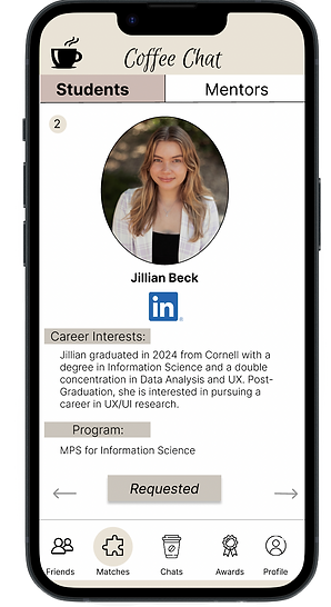
Connect with Student or Mentor Matches
Switch between Students and Mentors
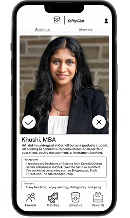
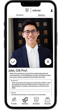

Users can press the 'X' to reject a match, and the check to connect

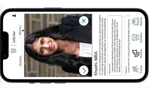

Chat feature allows matches to communicate
If it's a mutual connection, users can immediately schedule a meeting, or open a chat with their new connection
2
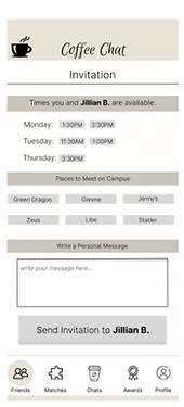
Generate Invitations with Connections
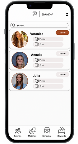


Users can generate synced calendar invitations from the 'Friends' page using the 'Invite' button
After choosing a time and place on campus, users can send the invite
Once the invitation has been accepted by the user's match, the scheduled meeting appears on the 'Schedule' page
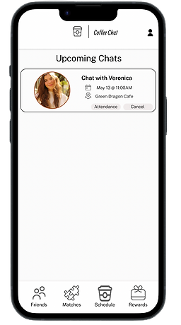
3
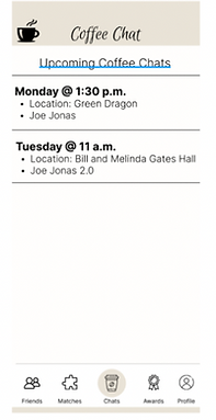
Track Attendance at Scheduled Chats
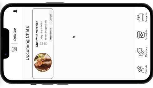


Users can click the 'Attendance' button to verify the presence or absence of their connection
One attendance is confirmed or denied, the chat disappears from the 'Schedule' page
4
Cancel Scheduled Chats


Users can cancel their scheduled meetings by using the 'Cancel' button on the corresponding meeting on the 'Schedule' page
Once canceled, chats disappear from the 'Scheduled' page
5
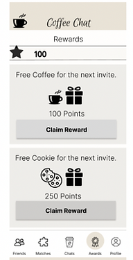
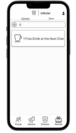
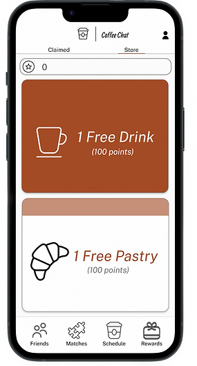
Claim and Track Rewards


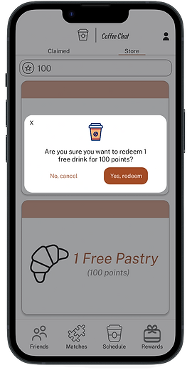
Users can navigate to the 'Store' tab to buy new rewards with their points


Users can press their claimed rewards to generate the QR code for baristas on campus to send
Their purchased awards can then be found on the 'Claim' tab
6
Impossible to Claim Rewards without Enough Points


Users can still attempt to purchase rewards when they have sufficient points but this will generate an error message
Reflection and Next Steps
When I began this project, I assumed we would be approaching the isolation of graduate students from a perspective of trying to improve their social circle. It quickly became apparent, however, that most graduate students are more concerned with expanding their professional network rather than social one. Ultimately, my team and I decided that the best way to manage this dichotomy was to find a solution somewhere in-between. The best professional connections are those that a person is able to maintain and that comes from social interaction.
I learned that what you believe your user group wishes to achieve vs. what they actually desire can be very different ideas. Additionally, while going through the design iteration process, I realized that although paper prototypes are tedious, they are a great way to test workflows. Finally, I learnt through this case study that you should never be afraid to keep working on a project on your own if you feel there's more you can contribute to it!
The next steps for this project would be:
1. RE-TEST
Conducting additional usability tests with my updated figma prototype would allow me to understand any further changes the design requires
2. EXPAND USERS
Although the app is designed for graduate students, professors who serve as mentors for the app will be using it as well. I would need to run contextual interviews with these mentors, in order to create additional features that might currently be missing for this expanded user group